DATE
2024
21Shares ONYX: ETF order management
Modernized a legacy platform with a new visual language, dual-theme support, and a order management dashboard — elevating clarity for financial professionals in ETF order management.
Order Management
Crypto Finance
Role
Lead Product Designer
Category
ETF management
Company
21Shares
Tools
Figma, Tailwind UI, FigJam
Team
Designer, CTO, 3 Engineers
Timeline
12 months

Overview
Onyx is a B2B financial platform where legacy UX was slowing users down and increasing friction in critical workflows. As Lead Product Designer, I partnered closely with the CTO to define and deliver the UX foundation for Onyx V2.
Onyx struggled with fragmented UX that limited clarity and velocity in high-stakes workflows. I led a system-level redesign for Onyx V2 that improved usability, increased delivery speed, and gave finance teams a clearer, more reliable platform to work from.
Problem
Onyx’s legacy interface struggled with an unimaginative UI, inconsistent visuals, and patterns that made core workflows harder than they needed to be. Data-heavy screens and multi-step forms often frustrated users, and the UI’s scattered component usage added unnecessary complexity and technical debt. Professionals had trouble orienting themselves quickly in cluttered layouts, which slowed them down and affected both accuracy and speed.
Opportunity
Modernize the system with a tokenized, dual-theme design system and a consistent set of components to enable quick, high-impact improvements without overwhelming engineering. Introduce a “high-importance-first” dashboard and more predictable patterns to increase clarity and speed across high-frequency workflows. These upgrades would support higher adoption, stronger satisfaction, and more dependable delivery velocity.

My Impact
System modernization
Led a full audit and refactor of the Onyx design system, removed redundant components, introduced updated tokens, and unified everything under a modern, consistent baseline that is easier to maintain.
Engineering efficiency
Selected the implementation framework with the CTO, optimized component defaults using an 80/20 impact per effort approach, and reduced rework while speeding up delivery by an estimated 30 to 50 percent.
Delivered complete redesign
Created a full screen set in light and dark mode, standardized key patterns and states, and improved dense workflows where power users reported noticeably better clarity and overall UX.
Research‑driven UX upgrades
Ran interviews and surveys to uncover usability and workflow issues, translated the findings into a prioritized dashboard, and introduced clearer patterns that improved onboarding and lowered support needs.
Phase 1 — System Review and Component Refactor
Design System
Design System Audit & Token Update
Reviewed every component and token to remove duplicates and dead styles, then created one clear source of truth.
Modernized color, spacing, typography, and state tokens for better contrast and clarity, aligned with Light and Dark mode.
Defined consistent UI Patterns for various components to simplify cognitive load for users in dense, data heavy screens.
Component Refactor for Reuse & Predictability
Mapped each legacy component to its updated version and aligned variants, properties, and behaviors.
Rebuilt patterns on Tailwind UI where it made sense, adjusting only what was necessary to keep interactions reliable.
Shipped quick UX fixes like clearer labels, improved button styles, and more predictable feedback patterns (notifications, info icons) to improve clarity while deferring larger workflow changes to V2.
Delivery Guardrails, Artifacts & Handoff
Created full screen design sets in Light and Dark mode to make reviews and implementation clearer.
Documented tokens, spacing, and usage guidelines to ensure consistent adoption by engineering.
Worked early with the CTO on framework decisions to reduce rework and align component choices.
Planned a staged rollout focused on the most frequent workflows to keep velocity high and rework low.
Phase 2 — The Blueprint: Deep Component Documentation
DESIGN SYSTEM
Building on the updated system, I turned the Onyx Figma Component library into a practical blueprint engineers could ship from. I did this by documenting anatomy, specs, variants, sizes, usage rules, and state behaviors for each component, aligned with dual-theme tokens. I standardized handoff using the Spectral plugin reducing ambiguity and speeding up consistent implementation across the visual update.
From Figma to Front‑End: A Single Source of Truth
Each component page now follows a clear, repeatable template: status symbols, visual anatomy, spec tables (spacing, typography, tokens, elevation), variant and size matrices, usage, and state ladders (hover, focus, selected, processing, success, error). Theme color checks ensure tokens are connected correctly in both Light and Dark modes while Dev Mode connects designs to implementation details which keeps designers and engineers fully aligned.

Smart Components
All components in the component library interact with each other to get highly consistent components. They are flexible in use, but built to ensure rigidity in style and lay-out. They're also easy to maintain through their connected nature.

Tokens and style specs
Having clear documentation with tokens and variables helped everyone find their way in the component library. All values are mapped to theme tokens so both Light and Dark modes behave consistently. Tables outline exact values and usage constraints to support the use cases for dense, and complex screens.
Handoff-ready annotations
Documentations included Spectral measures, callouts, paddings, gaps, etc. Dev Mode panels will add even more to that, like the essential properties in code. this ensured that both tech and non-tech stakeholders could find their way in the document, and hand-offs were smooth and clear.

Behavior and interaction
I included other sections like behavior, which covers interactions across tables, forms, navigation, notifications, and title areas.
These guidelines ensure predictable behavior across complex workflows and help maintain a consistent feel throughout the system.
Phase 3 — Systemized Artifacts and Theme Delivery
SYSTEMS
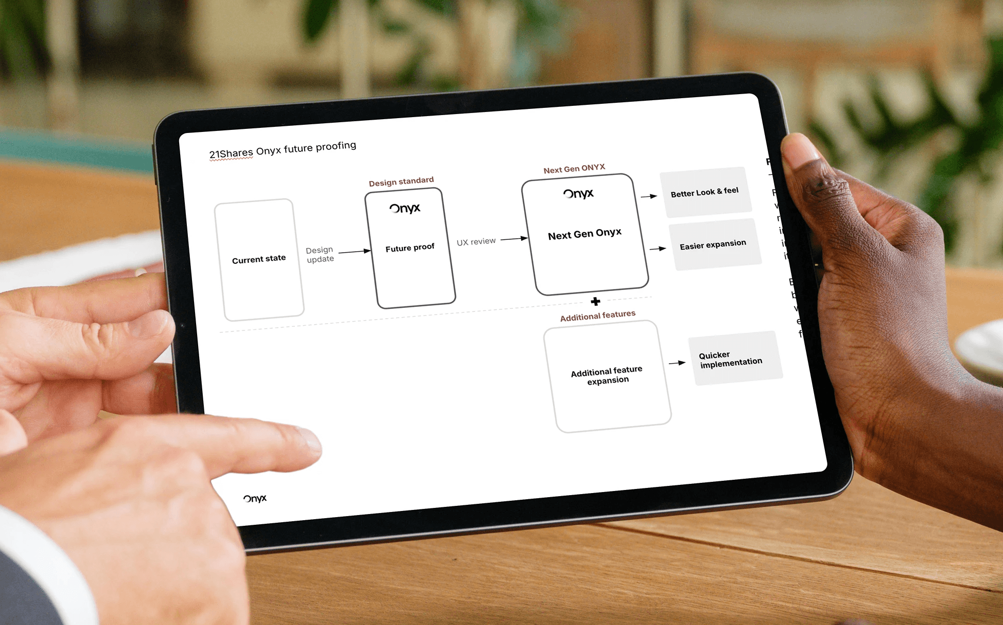
I partnered early with the CTO to select the front-end framework and define a pragmatic implementation strategy. The goal was clear: inherit robust interaction patterns from the framework, minimize bespoke engineering, and map the updated Onyx tokens and components directly to defaults—so the team could ship quickly with consistent behavior and theme consistency.
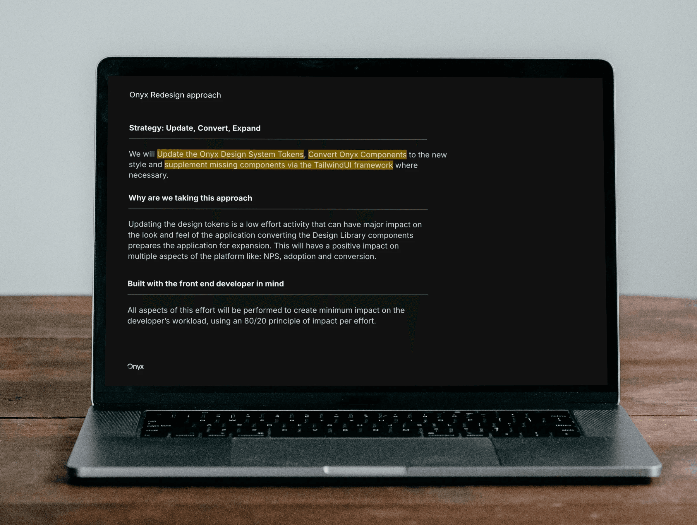
Strategy: Minimal Change, Maximum Leverage
We adopted an 80/20 impact-per-effort approach. Default components were lightly skinned using the updated design tokens, while gaps were filled with Tailwind UI patterns. This ensured predictable accessibility, faster rollout, and reduced rework. The plan tied design artifacts to Dev Mode specs and a clear handoff path, keeping designers and engineers in sync.
Implementation
Design Token-to-Framework Mapping
Together we established a direct mapping between Onyx design tokens (color, typography, elevation, states) and the framework’s variables. This made light/dark theming a property from the start, not an afterthought. Components inherited states (hover, focus, selected, processing, success, error) and accessible defaults form Tailwind which cut custom logic and accelerating delivery.
Components
Default-First, Tailwind-Backed
We skinned default components to match the new system and supplemented missing pieces via Tailwind UI (e.g., pagination, tabs, tooltips, cards & tables). Variants and sizes were standardized from the documentation, reducing edge-case drift. This approach preserved reliable interactions while achieving the desired look and feel with minimal override complexity.
A tailwind UI template helped engineers deliver

Phase 4 — Interview‑Led Personas, Data, and Flows
RESEARCH
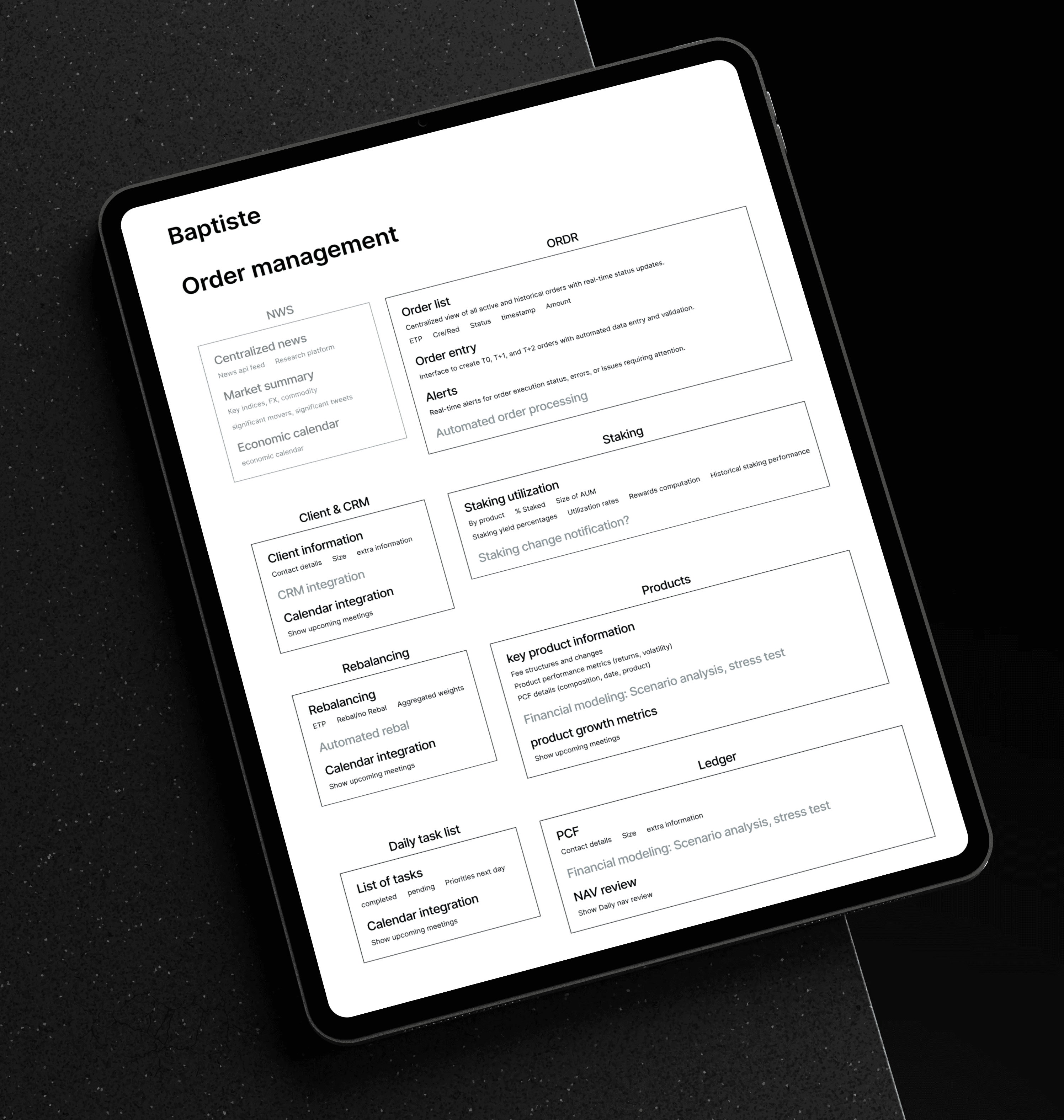
This phase forms the qualitative backbone of the redesign. I had deep interviews with power users, processed them with AI and built personas from their pains and needs. Additionally I mapped end-to-end user journeys directly from daily schedules and core responsibilities. The personas show how recurring frustrations like unclear status, poor navigation, and tricky edge cases translate into improvement opportunities, word clouds of required functionality. Together, these findings created a practical foundation for the information architecture and dashboards that followed.

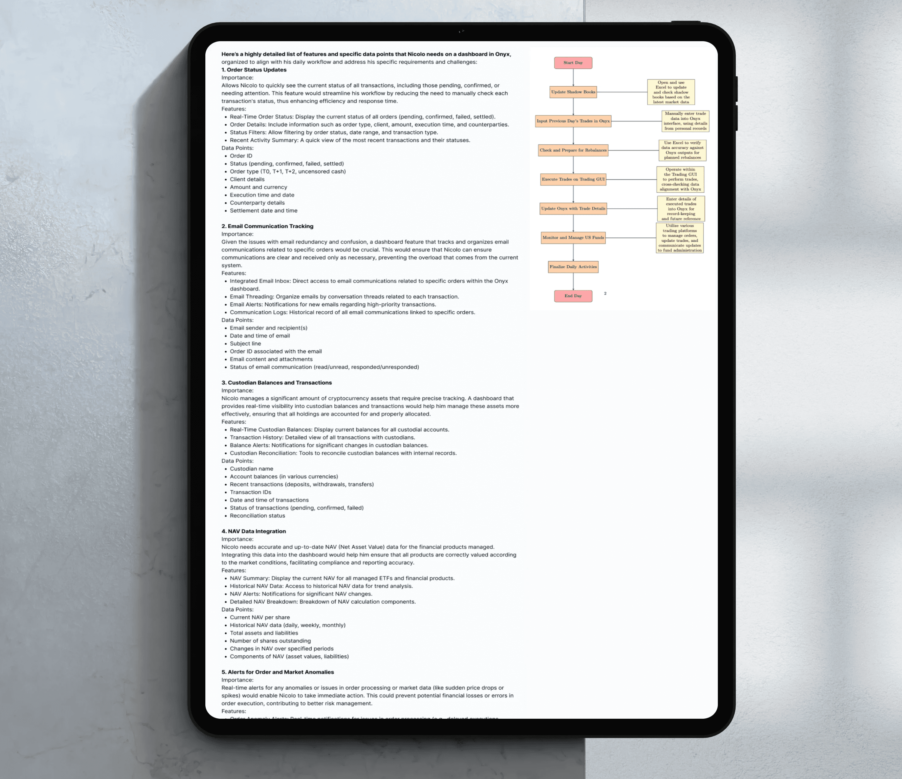
82%
of users struggled with identifying status indicators effectively in the legacy UI.
67%
reported that multi-step forms were inconsistent, leading to second-guessing and rework.
75%+
wanted a dashboard for quick orientation and faster access to high-priority actions.
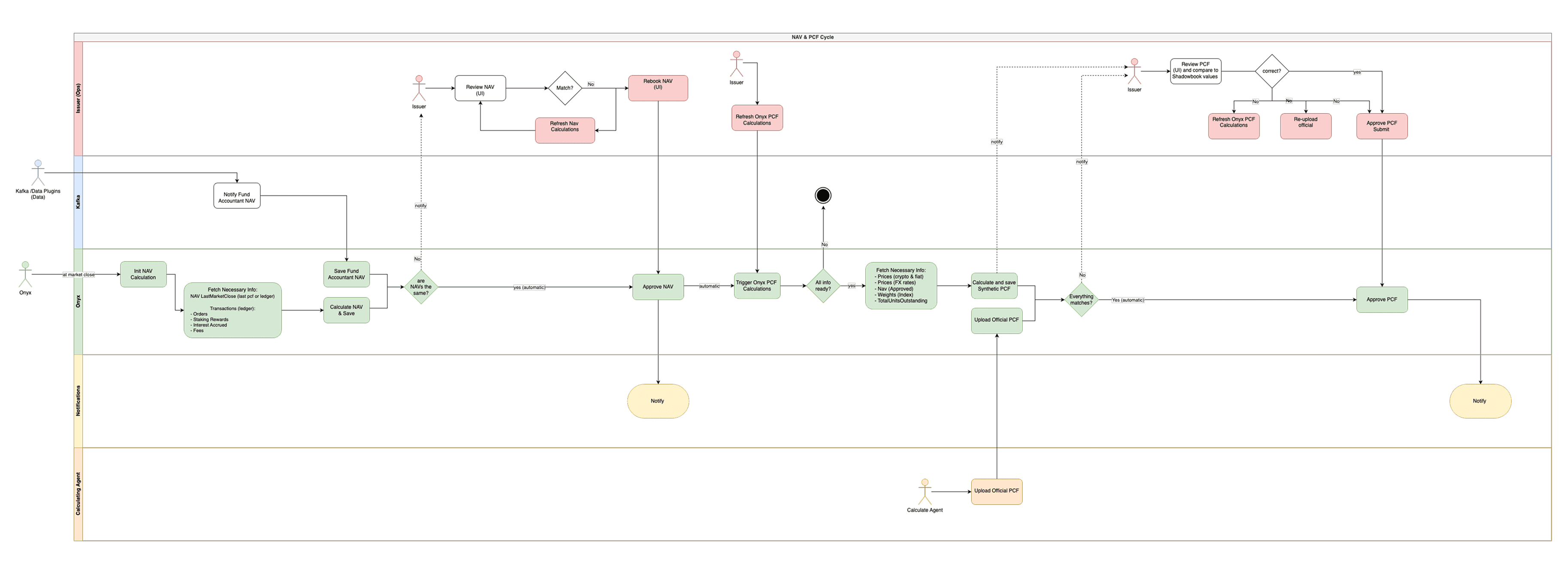
Data pipeline flowchart
To understand how we can adapt the application to desired users flows I find it also important to understand the technical architecture. This will especially impact certain action sequences, dependencies and notifications.
Phase 6 — Onyx V2: Layout, User flow, and UI improvements
SYSTEM
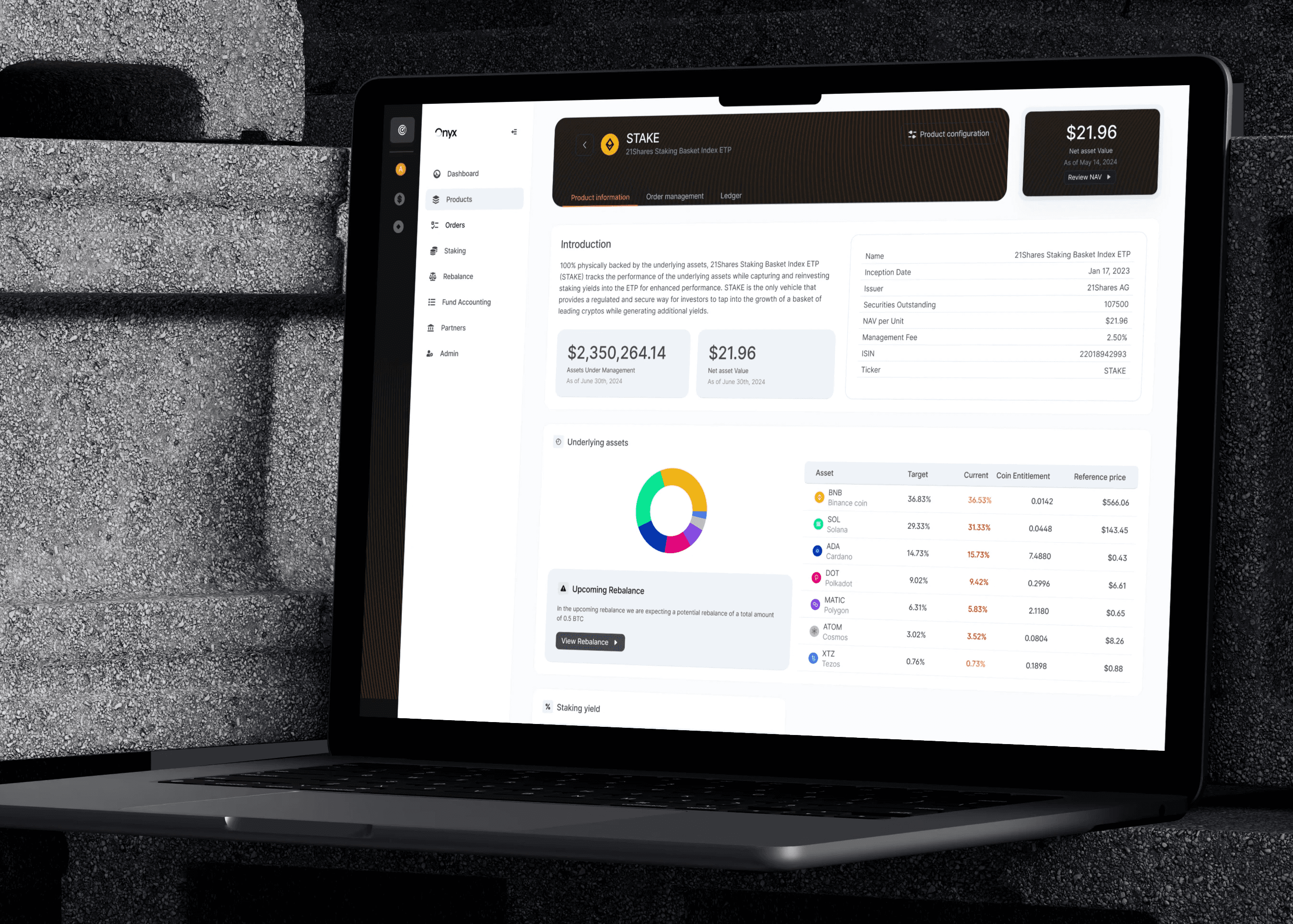
Focus on Product management
In the user flow we found that users also like to have navigational options. That's why we increased the flexibility of product pages, to give more options for seeing product information, managing core settings and rebalancing them when needed.
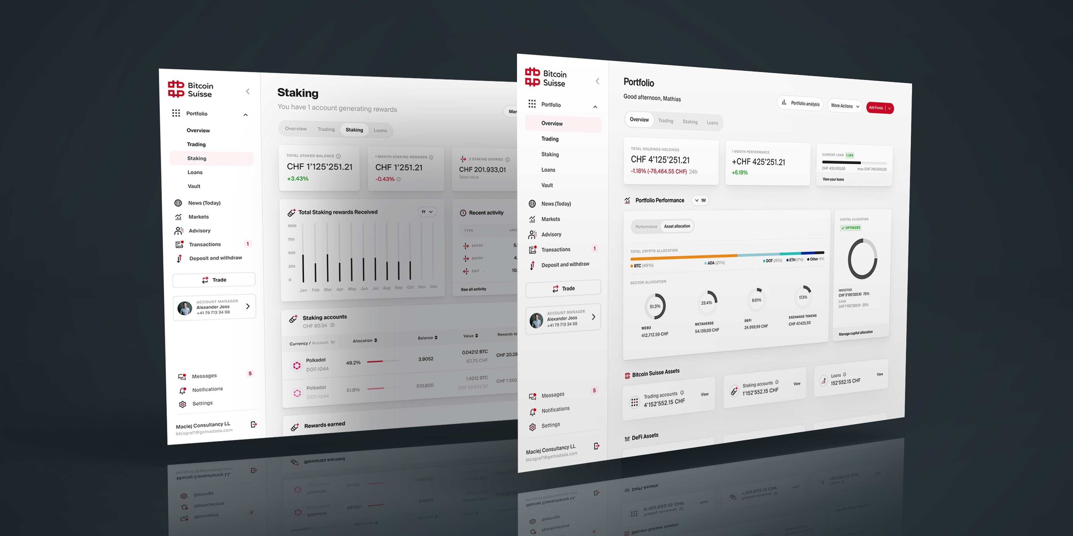
Screen design sets with light and dark mode
The easily switchable theme ensures increased usability and UX, even when working in dark environments. Having dark and light mode requires all design tokens to be implemented perfectly.

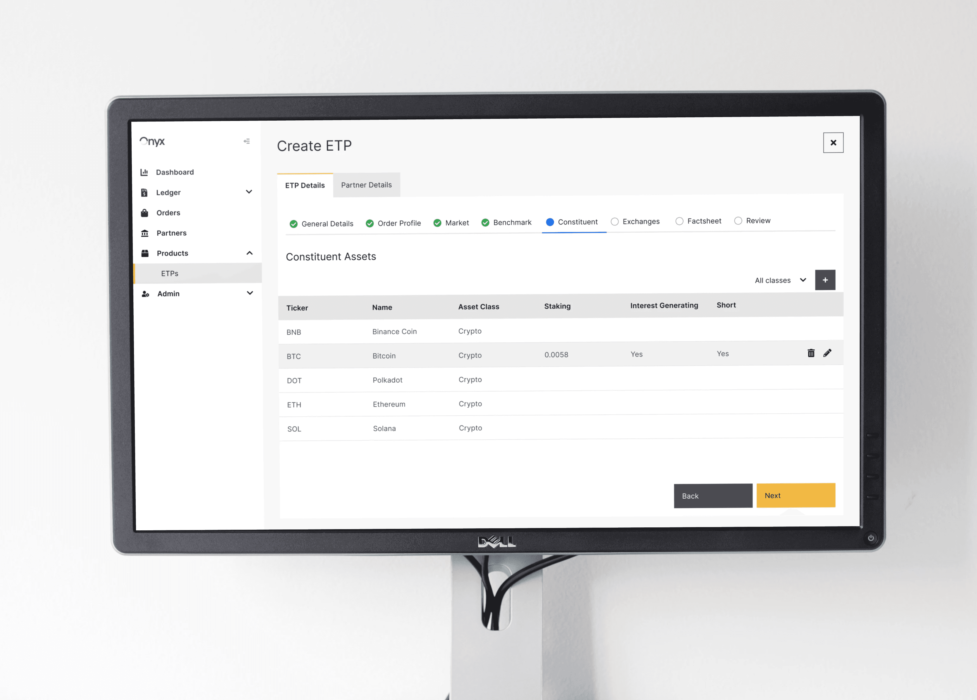
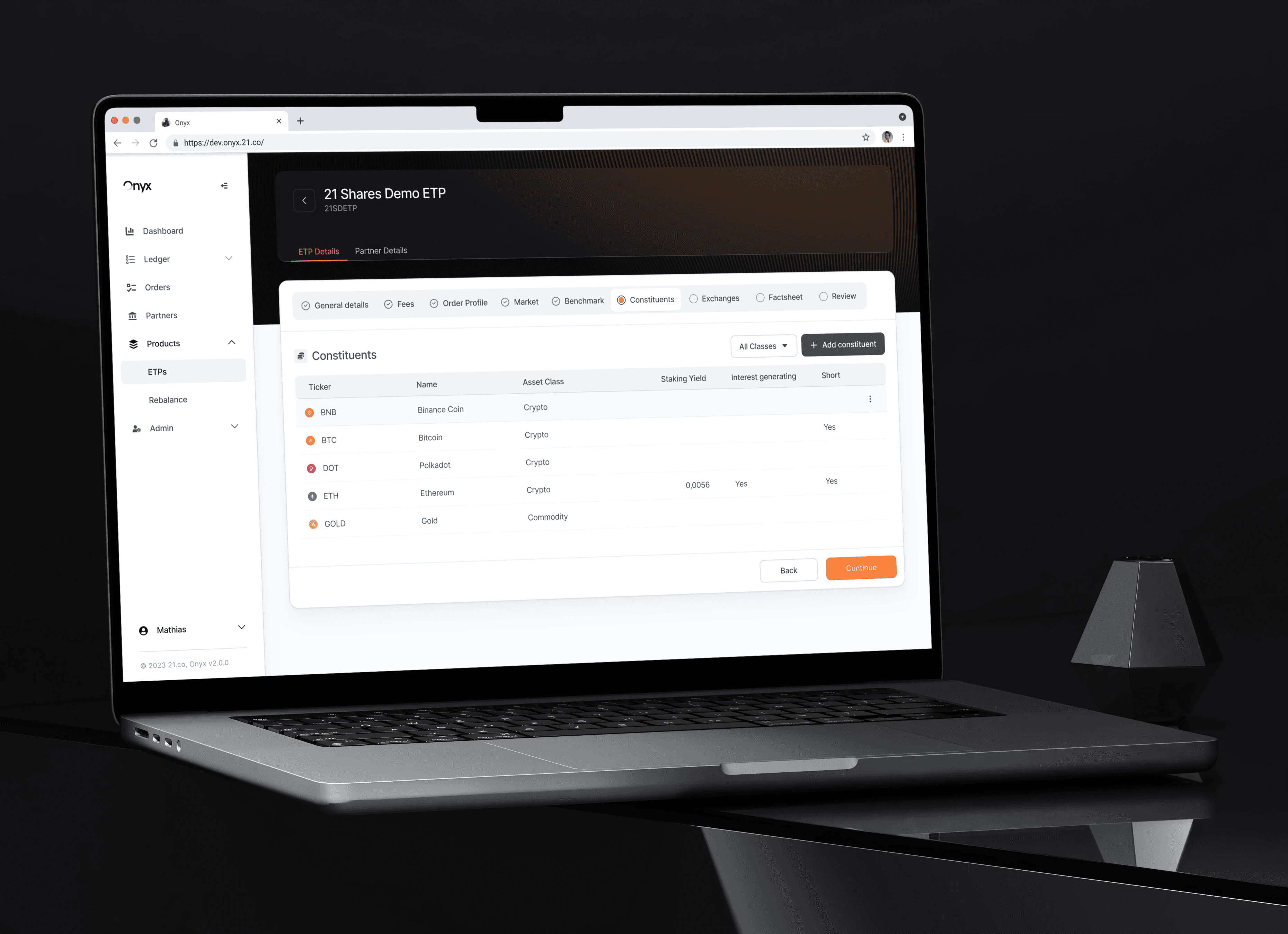
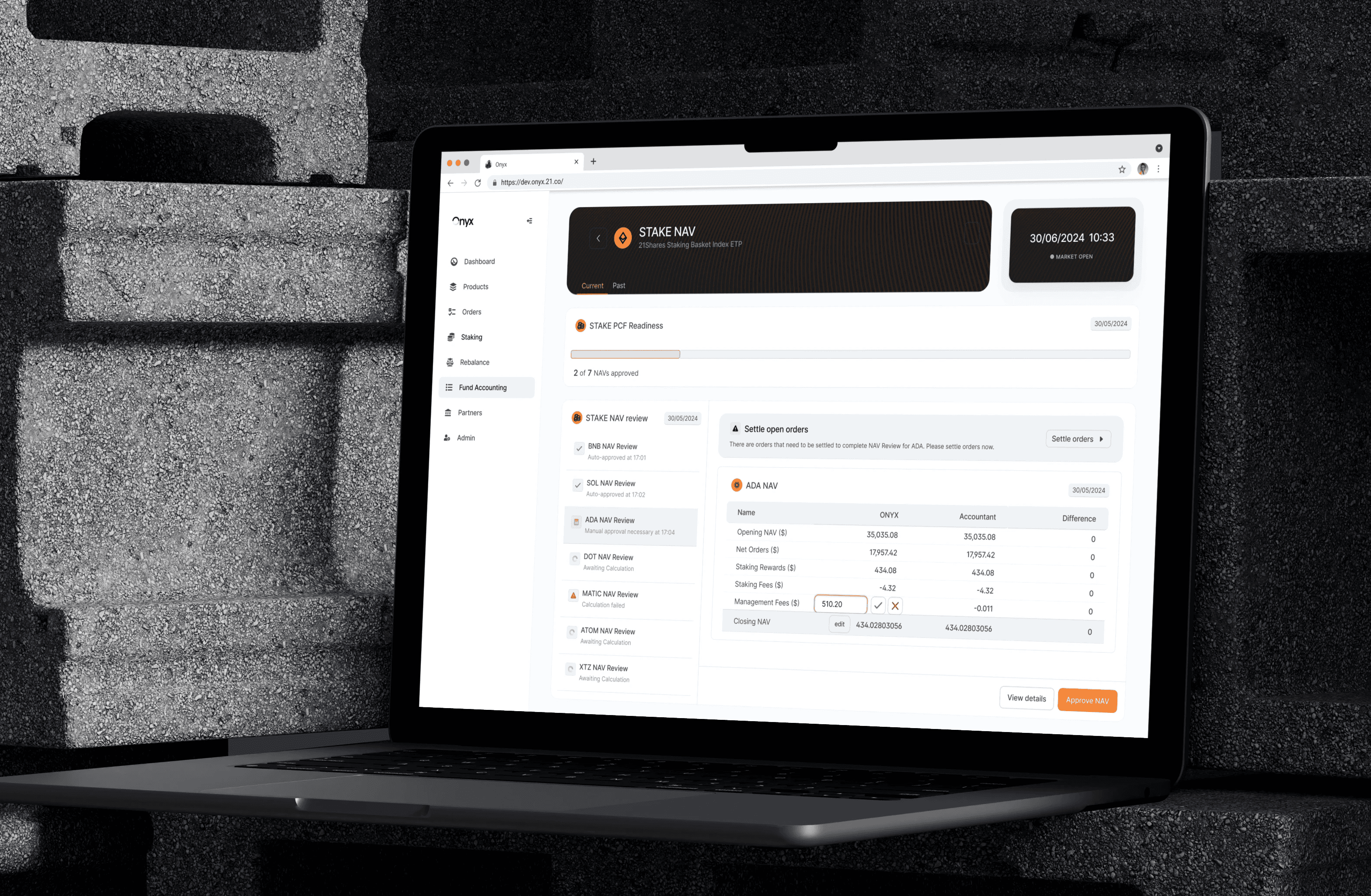
Deep Dive Screen: Orders
Here's a set of screens for Orders. From the original design and Design System, you can see an updated version in the middle. The eventual ONYX V2 design incorporated a lot of the feedback and improvement ideas from the research and deep dive interviews we did.

Phase 7 — Dashboards and Prototypes for User Testing 
DASHBOARD UI
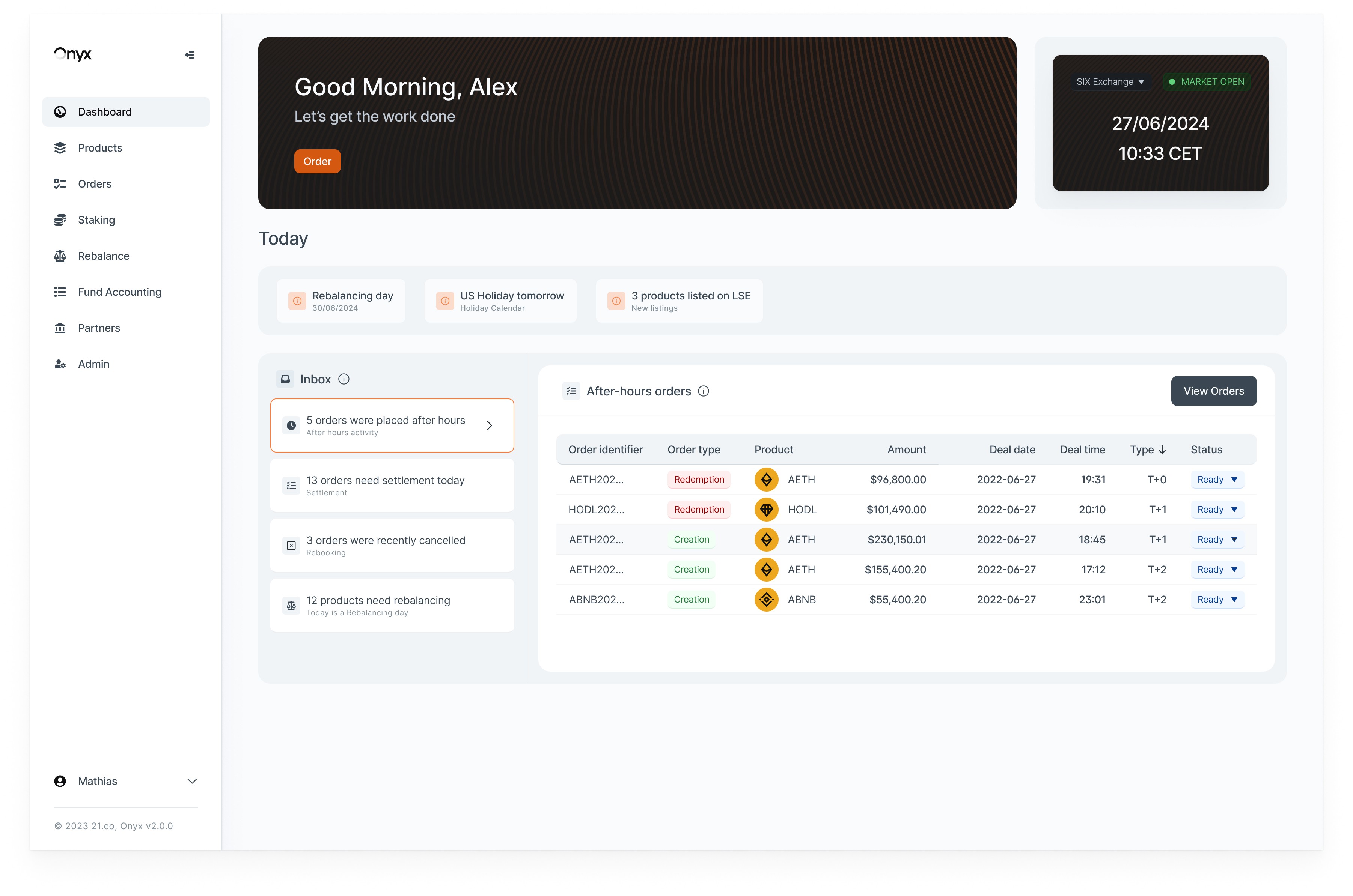
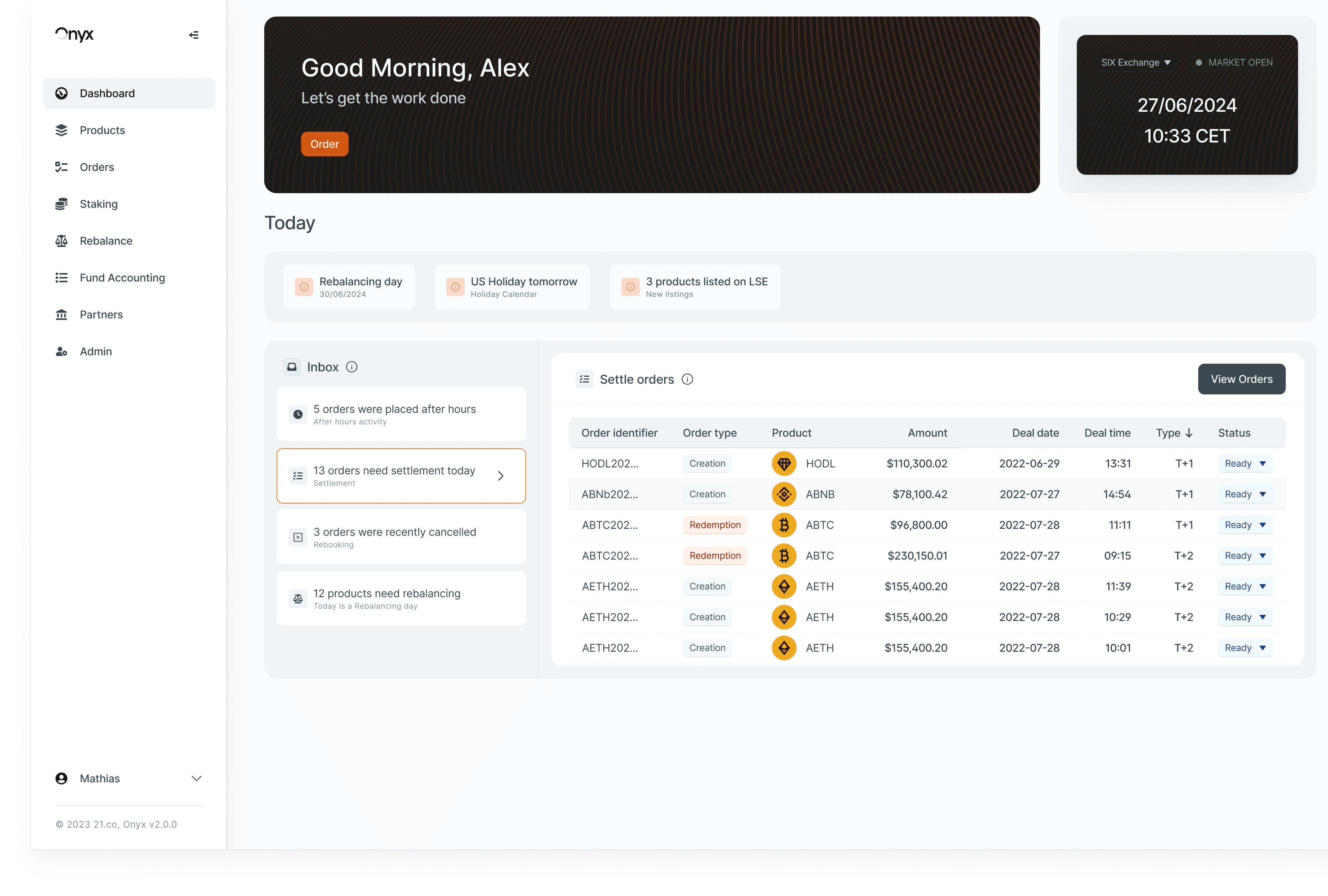
I iterated the cockpit-style dashboard to give users one-click visibility into statuses, alerts, and key metrics. I validated the flows and state transitions with a final testing prototype to ensure everything worked under real pressure. The design focuses on triage speed by mapping the order lifecycle and exception handling to clear queues and status cards across Orders, NAV, PCF, and Rebalance.

Phase 8 — Outcomes & Business Impact
OUTCOME
System modernization unlocked smoother delivery and broad adoption
User feedback and internal teams consistently reported that the updated system was clearer, easier to work with, and faster to ship.
The new tokens, components, and visual rules made implementation more predictable, which helped engineering move with less friction and reduced back-and-forth.
OUTCOME
Standardized tables/forms and clearer states removed friction in daily workflows
The updated patterns made dense screens easier to scan and act on.
Power users noted fewer detours, less second-guessing, and a smoother onboarding experience for new team members thanks to predictable tables, forms, and feedback.
OUTCOME
Improved lifecycle visibility boosted confidence and reduced missed actions
Users highlighted that clearer states and consistent feedback made it easier to understand what was happening and what needed attention.
This reduced ambiguity in high-stakes tasks and led to a noticeably more reliable experience for the teams relying on the platform.

"Mathias is a very talented designer who thinks not just about the UI (interface) but also about the UX (experience). This is is definitely very helpful and important for building great applications that users need to interact with. The overall look and feel of Onyx has improved dramatically based on the work that Mathias has put in."
"Mathias is a great product designer who consistently delivers quality work. He communicates effectively, maintains a positive attitude, and shows a strong interest in finance topics, which adds value to his designs."
Various Team Members